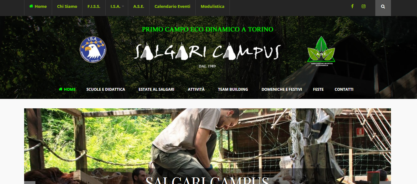
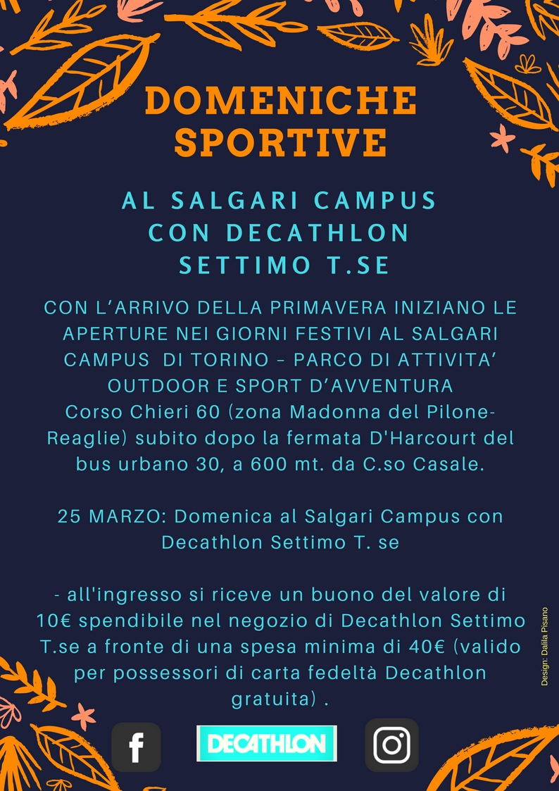
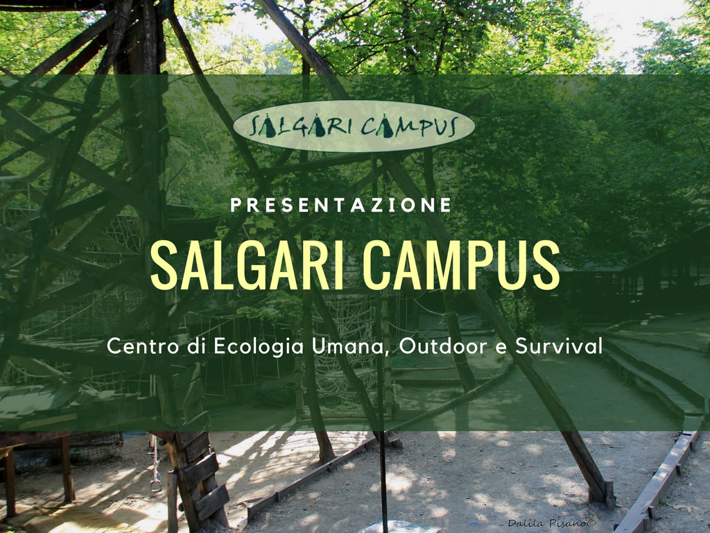
The Salgari Campus changes its graphic face. Goodbye to our old image in sand and ocher colors, to the static graphics and logos in white background.
The new logos will appear as soon as possible even in leaflets, t-shirts and official posters.
The goals of the creators
The reference point will be the basic symbol of the Salgari Campus but cleaner, designed to ensure identity, consistency and continuity to the image of our camp under the sign of the visual order.
We wanted to achieve a “solution that is however contemporary but that did not distort the identity that has always accompanied our work”.
It does not change the used font, but it changes the way the name stands out on the backgrounds.


